“All pedagogical art is bad art, but all good art is pedagogical.”
Discuss.
It does sound like the prompt for an essay topic, possibly one of those nice balanced argument topics we ask our IELTS students to do, but it is in fact another “found quote” from one of my old notebooks. This one I recognise as one of my own thoughts, which I think is about four years old, but I thought it would be fun to revisit it now.
Let’s start with a case study. Un-named coursebook has a first unit on family / domestic life and present tenses, which I guess is fairly standard. There are 22 distinct images in the unit across 10 pages, two of which are illustrations and the rest photographs. Three are location shots and the rest are all of people. In these photos and illustrations, there are 37 people.
When I look at the images, almost the first thing I notice is how, especially given the fact that these pictures are meant to be illustrative and representative of life and the themes in the unit, is how fake they all are. Just in terms of the image composition and selection, this is not a version of family life I recognise. Of the 37 people in the images, 28 are smiling, 7 have neutral expressions, and in only one image do the people have a negative or angry expression. Maybe this says more about my family life than anything else, but I don’t think we spend 75% of our time smiling. Plus most of these are plastered on professional smiles for the camera anyway – nobody really smiles when they’re doing the washing up or dusting a lampshade, or do they?
Then there is the issue of inclusion and diversity. It will probably not be a shock to know that of the 37 people depicted in the case study unit, 33 were white, one person was black and three were Asian. There were twelve male and twenty five female characters. There were no images of people with disabilities and curiously only one person who had glasses on – a girl who was studying and had them pushed up on top of her hair so it wasn’t immediately obvious she had glasses. I only mention this last part because of a Fiona Mauchline (@fionamau) tweet about how difficult it is to get pictures of women wearing glasses into coursebooks. (#why?)
The issue of inclusivity in representation is a complex one and I will freely admit that I am undereducated in this area. I do wonder what the logic is behind some of these choices though. I understand that different cultures view these things in different ways and I also understand that this is not necessarily an excuse for making these choices, even if it might be the reason. But then what is the purpose of including these images at all, if not to provoke question and comment?
Of the 22 images in the case study unit, only four of them appear to be there for a specific discussion point – three as the lead in discussion to the unit and one as an illustration for a speaking activity. The other 18 appear to be there for illustrative purposes, perhaps to break up the text, to put some colour on the page, or possibly just to give the students something to focus on while the teacher works through the exercise. I would be interested to find out from students what they think about all these images and whether they pay them any attention at all.
For me, these images miss an opportunity. None of the images are particularly striking, none of them provoke thought and it is no wonder that when faced by some of these pictures and asked to comment on them, students struggle. They don’t represent a lived experience, the represent a stock photo catalogue view of culture and society which may or may not be representative, but I would argue for most students is a far cry from what their own lived experiences are. Students in China, for example, are not going to have the same ideas of what family life looks like as students in Spain, or Saudi Arabia. But then are these images meant to represent the students’ own culture or the target language culture? I would argue they probably do neither.
The standard categorisation of texts in materials is TAVI (text as a vehicle for instruction), TALO (text as linguistic object) and TASP (text as a springboard for production) (see also links at the end for more on these). Perhaps, rather than choosing images for filler / because they look nice / break up the page, we should be choosing images on similar principles – surely everything in pedagogical materials should be there for a reason and should be maximally exploitable by the teacher. As materials move more towards embedding critical thinking skills and digital literacies, should we now create a similar set of categorisations for images? Can we move away from the stock photo unreality of bland anodyne culture and towards something that is more engaging and ultimately more real?

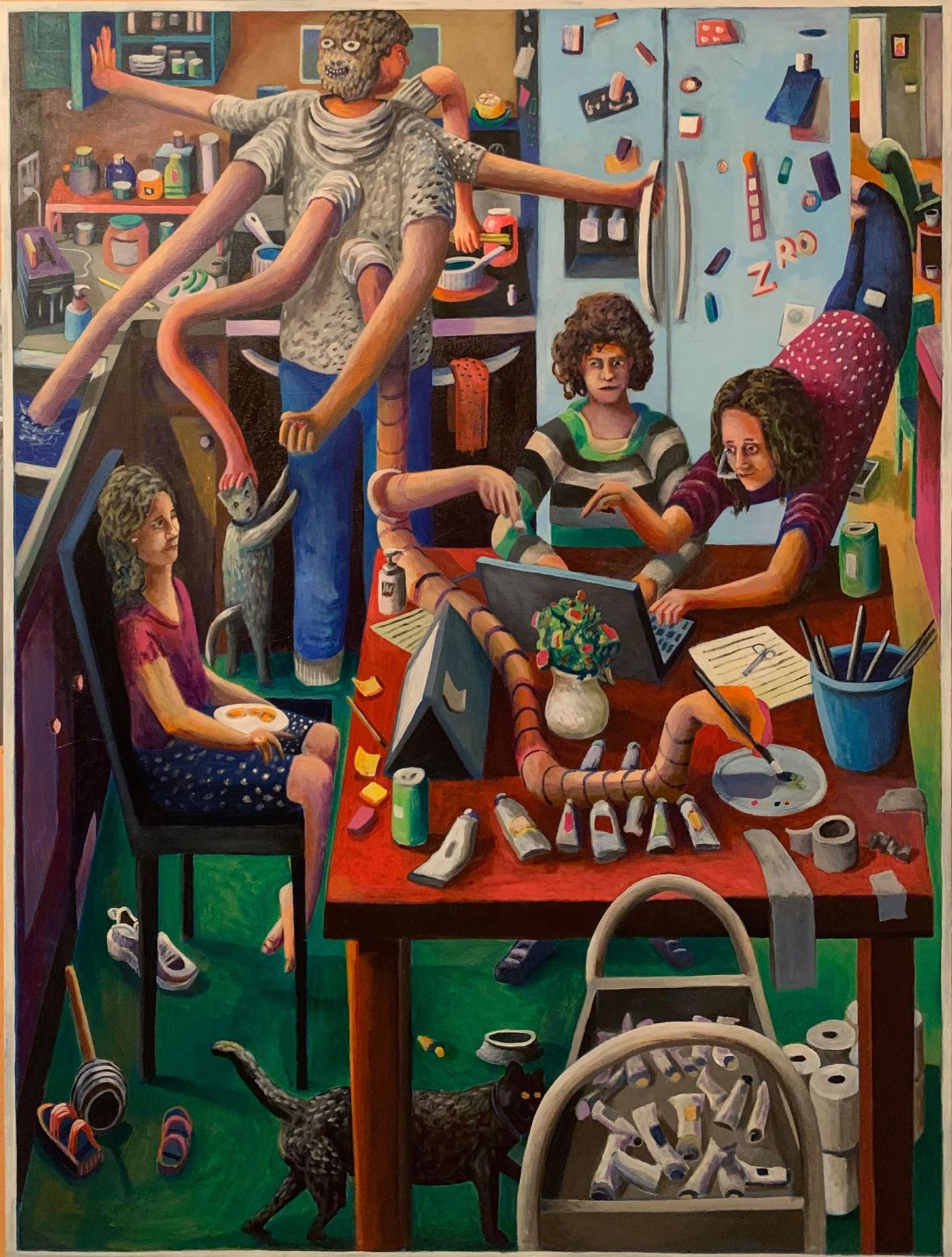
Image Credits:
Leif Larson “Family Life during a Pandemic” (2020): https://pbswisconsin.org/news-item/oshkosh-artist-paints-pandemic-portraits-of-home/
Horace Pippin “Sunday Morning Breakfast (1943) https://www.slam.org/collection/objects/59173/
Further Reading:
For more on TAVI TALO & TASP: https://www.teachingenglish.org.uk/article/text-language-classrooms-talo-tavi-tasp


Tuesday 11 May 2021 at 05:22
Its really an eye opening discussion with related to illustrations we find in textbooks in most of the contexts.
Wednesday 12 May 2021 at 13:59
Thank you. I do feel it is a discussion we should be having more….